Abortion Access
Project Type: Academic
Duration: 3 Weeks
Roles: UX Researcher, UX/UI Designer
Tools: Figma, Canva
Platform: iOS
Overview: During a 3-week UX Design bootcamp at BrainStation, our team undertook a digital design project. The primary objective was to address a human-centric problem by conducting thorough UX research and integrating user feedback and insights into the final solution.
Empathize
The Problem Space
Since Roe vs. Wade was overturned in June 2022, each state can now decide the rules for abortion. This has made American women more confused about whether they can get an abortion, who can help them get one, and where they can go to receive abortion services.
The Design Process
I adopted a non-linear approach for the project, leveraging the design-thinking process. With a strong emphasis on user-centered design, iterative development based on multiple rounds of feedback was crucial. Below is an outline of how the design-thinking methodology was implemented.
"It is difficult to know what is going on with all the different news sources."
"I feel Illiterate sometimes when I Google search. What I want doesnt come up, let alone searching recent policies. "
"Very disenchanted with our nations reproductive justice and health.
Define
Ideate
Prototype
Test
19 Million
19 million women of reproductive age living in the US are in need of publicly funded contraception and live in contraceptive deserts.**
As a result of my secondary research findings, I wanted to learn what understand 3 main things:
Do women want to be current on policy changes that effect abortion accessibility near them?
Do women understand the risk of not knowing where to find an abortion for them or a woman they know?
Do women already know what is available to them, costs and/or are they up to date on local policy changes that could effect the access?
During the interview process, I ensured a relaxed and non-judgmental atmosphere, fostering open communication. Here are additional
particulars regarding the interviews:
Medium:
3 interviews were conducted via Zoom
2 were conducted in person.
Define
Define
Pain Points
Having time to read and understand policy
Knowing what to look for when wanting to be updated on Reproductive policy.
Goals & Motivations
Access for all women
Current knowledge to be able to share policy change with friends
Having the resources at her fingertips to access
Behaviors
Goes to Womens’ Rights marches when she can afford them.
Works hard and plays harder
Tries to watch news and keep up with current events
Once the interviews were completed, common themes and insights were derived from them. This was done by creating the following affinity
map using key points and observations gathered from the interviews.
Motivations
Behaviors
"I often think how women in different states navigate reproductive rights."
"Abstinence is my go to contraceptive"
"I try to check in with my friends about their reproductive health."
"I feel so much shame and judgement around sex and abortions"
"I go to the OBGYN once a year...at least".
"I am always on social media and see polarizing posts and often times mis information surrounds womens reproductive rights."
"I don't take tnor have the time to keep up to date on state policy. "
"I try to watch the news 1-2 times a week"
The following themes and insights were derived from the Affinity map:
Theme 2: Access
Theme 3: Transparency
Policies that are understandable to the average person.
Women feel discouraged with the current information and policy around their reproductive rights.
How might we empower American women with up to date information on
their reproductive rights and where they can access those rights.
The Pivot
After researching and creating the user stories based on the Persona, I found two different paths that I could go down.
Path 1 -> an app for women who need to find an abortion clinic.
Path 2 -> An app for women who care about thier access to reproductive rights and want to be up to date on any policy or changes that affect those rights.
I decided to focus on Path #2
Ideate
Ideate
User stories were generated according to the persona and chosen theme/insight. These stories were then organized and grouped into the
following epics:
Epic 1: Awareness & Education
Theme 2: Access
Theme 3: Transparency
Chosen Epic: Awareness & Education
Persona values women knowing about their reproductive rights
Aligns with Persona Goal - access for all women to reproductive healthcare
Aligns with Persona Goal - She wants to be up to date on reproductive policy
Aligns w/ Persona Pain Point- She does not have time to find and interpret news and policy changes, wants it to be easily understandable. (She considers herself pretty smart but if academic and political lingo discourage her to keep up to date then what about women who have even less education, resources and/or access to technology.)
Aligns w/ Insight Statement - Women feel discouraged with the current information and policy around thier reproductive rights.ur paragraph text
Chosen Epic Story:
As a woman, I want receive regular email updates about changes in
reproductive rights laws so that I can advocate for myself and make informed decisions.
Aligns w/ HMW - up to date information on their reproductive rights
Aligns w/ 2 Persona Goals- Current knowledge to be able to share policy change with friends & Having the resources at her fingertips to access
Aligns w/ Insight - Women feel discouraged with the current information and policy around their reproductive rights.
Aligns w/ Core Epic- education/awareness to current reproductive policy
Task Flow
Empathize
Empathize
Secondary Research
According to the Guttmacher Institute and Center for Reproductive Rights* and PowerTo Decide.org** they have conducted studies that have resulted in the following statistics. The following are a few of my findings:
24 %
Of American women will have an abortion within their lifetime. That is 1 in 4 women in the US.*
58 %
Primary Research
Participant Criteria:
Female
Ages 15- 45
Resides in the USA
Process:
A total of 5 participants were interviewed to collect data focused at the project hypothesis and assumptions.
The participants were interviewed using this script that is comprised of open-ended questions.
Primary Persona
““Womens’ rights should be just that, womens.”
”
Pain Points
"Abortion in half the US is highly restricted and mostly unavailable.
"Most women have regular access to an OBGYN through their insurance."
"I plan to have children, but I want to be a good time to do so. For instance, now would not be a good time for me."
"I often see protestors outside of my nearest Planned Parenthood"
"Women can't afford abortions, let alone travel, time off, food, etc to get to a state that allows abortions."
Theme 1: Mistrust
If my state is not looking out for my reproductive rights, then who is?
Insight Statement
Success Modal Page
Concept Sketch
of American women live in a hostile state or extremely hostile state to abortion rights.*
Mikaela George
Age: 22
Archetype: Courageous Planner
Occupation: Barista
Location: Cleveland, Ohio
Biography:
Mikaela is a 22 year old full time barista.
She comes from a single parent family
and helps her mom take care of her 2
younger siblings (11 yo and 14 yo). When
she isn’t working or helping her Mom she
enjoys going out with friends and dating.
She loves to have a good time, dreams of
one day maybe college for Gender
Studies.
Affinity Mapping
Themes & Insights
How Might We
User Stories & Epics
"It is crazy to think how many women go through the overwhelm of knowing you cant raise a child but then not knowing what to do or where to access a safe abortion"
"I wish there was something I could do to help more women access safe abortions"
"If i didn't have the means to leave this extremely restricted state if I needed to, I would not have chosen to move here."
"Women need to support women, that would be a great step in the right direction"
Access to the correct information and at the right time.
The tasks originating from pertinent user stories were utilized to shape the Task Flow. The subsequent Task Flow Diagram aided in defining
content components and the interrelationships among them:
Original Task Flow
REVISED Task Flow
Feedback Based Revisions
Success Modal Page
Original
I decided to add more to the task flow for a better and more rounded user testing experience.
Add-ins -> Lock screen and Login pages with tasks
Prototype
Prototype
Concept Sketch → Solution Sketch → Lo-Fi Proto Version 1
The tasks originating from pertinent user stories were utilized to shape the Task Flow. The subsequent Task Flow Diagram aided in defining
content components and the interrelationships among them. Below I will demonstrate the process of going from concept sketching to
solution sketches to then the first low fidelity prototype in Figma.
Login Page
Concept Sketch
Landing Page
Concept Sketch
Full News Article Page
Concept Sketch
Share Modal from Full News Article Page
Concept Sketch
Solution Sketch
Solution Sketch
Solution Sketch
Solution Sketch
Solution Sketch
Lo-Fi Prototype V1
Lo-Fi Prototype V1
Lo-Fi Prototype V1
Lo-Fi Prototype V1
Lo-Fi Prototype V1
Test
Test
Usability Testing
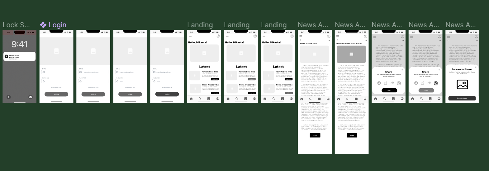
The end goal for each user in the user testing is: login to the app, find an article and share that article to the users Instagram.
Task 1 - Click the notification Abortion Access App on the home screen
Task 2 - Login, clicking the email and password to be prefilled and ticking the ‘remember me’
Task 3 - Click the top News article under “Latest News” and scroll to the bottom
Task 4 - Go to the next news article and scroll to the bottom.
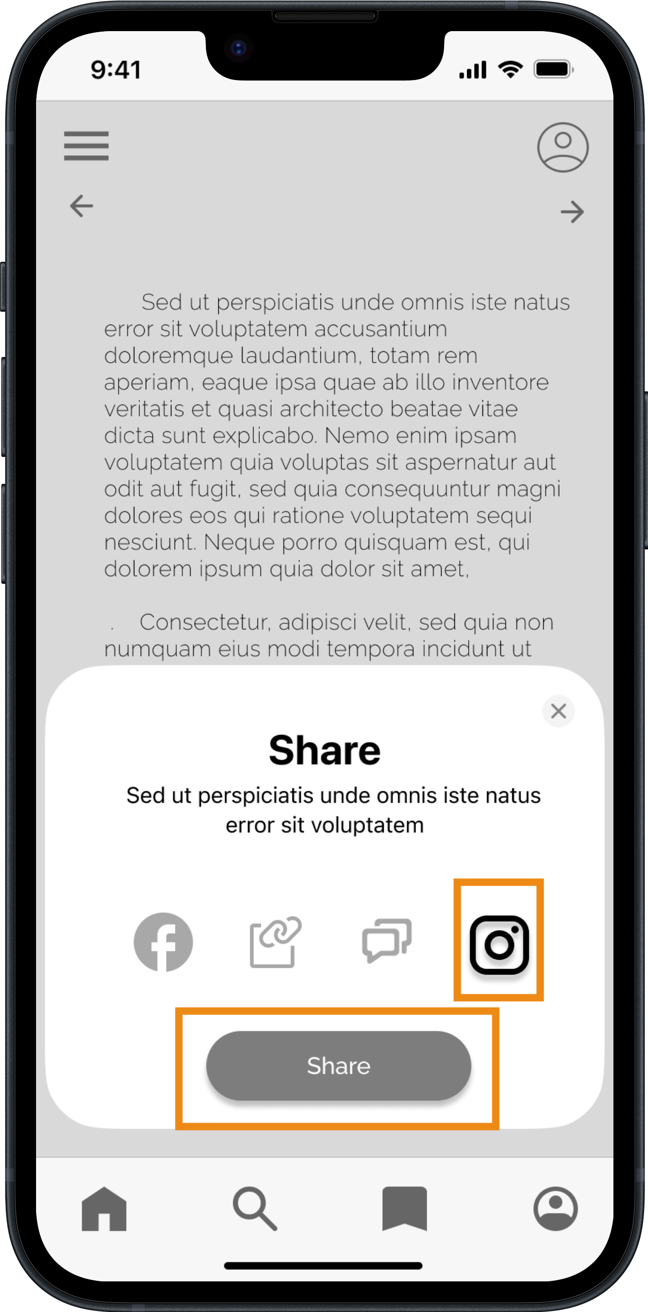
Task 5 - Click Share and share to your Instagram.
Share Modal Page
Original
Mid-Fi Prototype | Version 2
"Without access to abortion clinics, The course of a woman's life is changed forever and often for the worst"
Once I went through the user testing with 5 potential users. I had few changes to be made on several pages to enhance the user
experience. Below you can see the “Original Design” vs the “Revised Design”
Design Prioritization Matrix
Revised
Revised
Following the user-testing phase, a priority map was
established, and the most crucial feedback was integrated
into Version two of the Mid-Fi prototype.
Key Learnings
User testing is KEY to understanding how to better your app.
Everyone is different and seeing how people interact with your app is some of the greatests insights.
One of the most valuable lessons I've learned is that paying careful attention to small details is crucial when designing user interactions for an app.
A prime example of this is highlighting a button to indicate when it has been selected.
Providing additional details on buttons and titles would have helped users navigate the app more efficiently.
For instance, adding labels below the icons on the share modal.
"My body means my choice:"
I created a design prioritization matrix for all the improvements I would like to make on the Abortion Access. This is essential in UX as it helps
identify and focus on the most critical elements of a project, ensuring resources are allocated efficiently to address user needs effectively..
Next Steps
Here are the steps I would take to develop the prototype:
Expand the lo-fi prototype by adding more pages, such as a news feed page with scrollable articles.
Create a brand by starting with a moodboard and designing a logo.
Develop high-fidelity prototypes once the brand is in place.
Conduct thorough user testing throughout the process to ensure that the final product meets user needs and expectations.
Thank You for Reading!
Wanna See Another Project?
Explore my explanation that simplifies the understanding of Lifetime Value for marketers, allowing them grasp the value of each lead.
Click Here → Lead Pro
"I am so glad my state has Planned Parenthood and accessible abortion if I needed"


